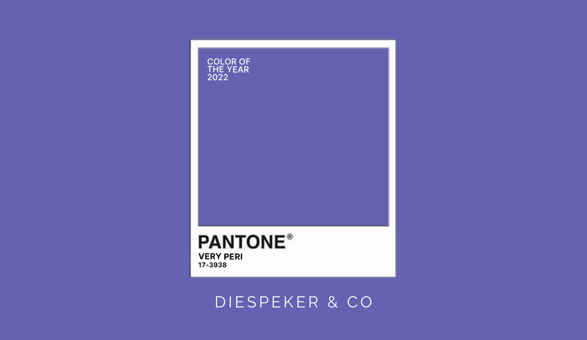
Very Peri is heralded as ‘a new Pantone colour whose courageous presence encourages personal inventiveness and creativity’. Being in the down to earth business of stone, we’d probably be a little more conservative and say that Very Peri looks to us like a very lovely shade of blue!
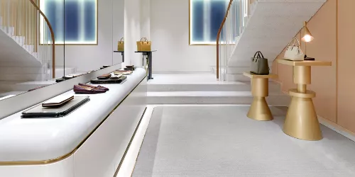
If you’re looking to utilise this attractive new colour in an interiors application, whether for a new home or the refurbishment of a kitchen or bathroom, you might wish to consider which stone designs would work well with it, whether for worktops, flooring or cladding.
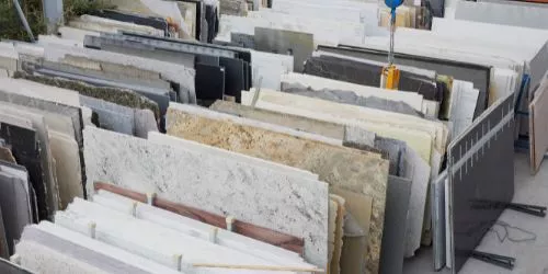
Although it is a ‘warm and friendly’ blue, it is also a very striking colour, so you may feel it is safest sticking to neutrals. For a very clean look, any white marble, conglomerate or terrazzo would be ideal. Marble MA001 (Thassos) is a pure white marble whilst within the terrazzo range, TE001 is predominantly white with grey and white chippings.
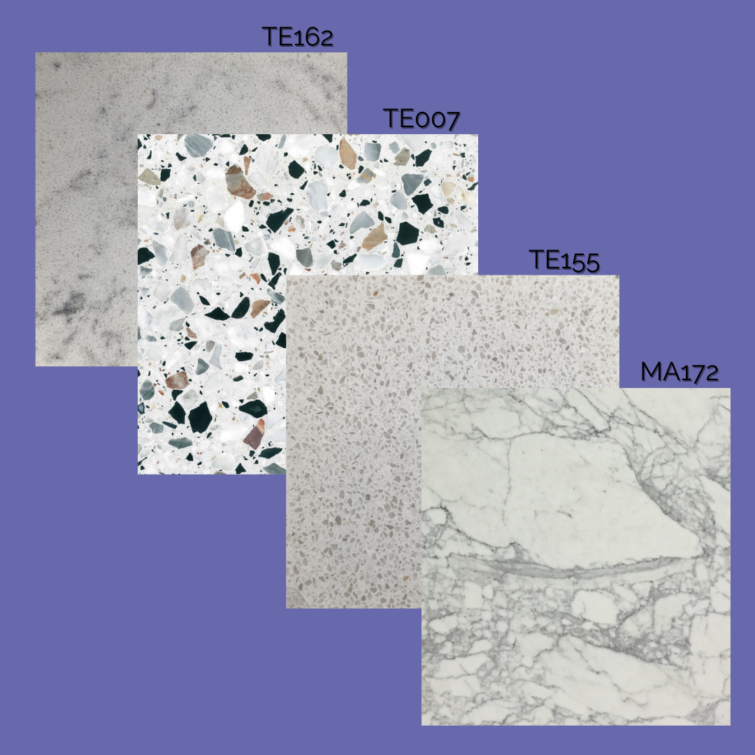
For added interest and to break a surface up, marble MA172 is a creamier base with grey veining, and there are a variety of conglomerates with veining to browse, including TE162. Our range of resin conglomerates also includes some great pale options with smaller chippings TE155. Whilst from our classic terrazzo designs TE007 is always a good option.
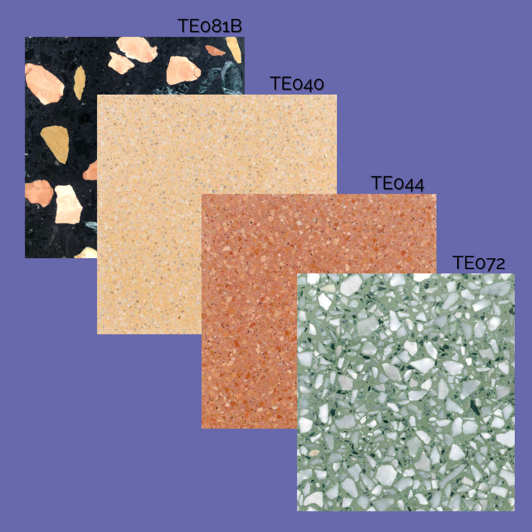
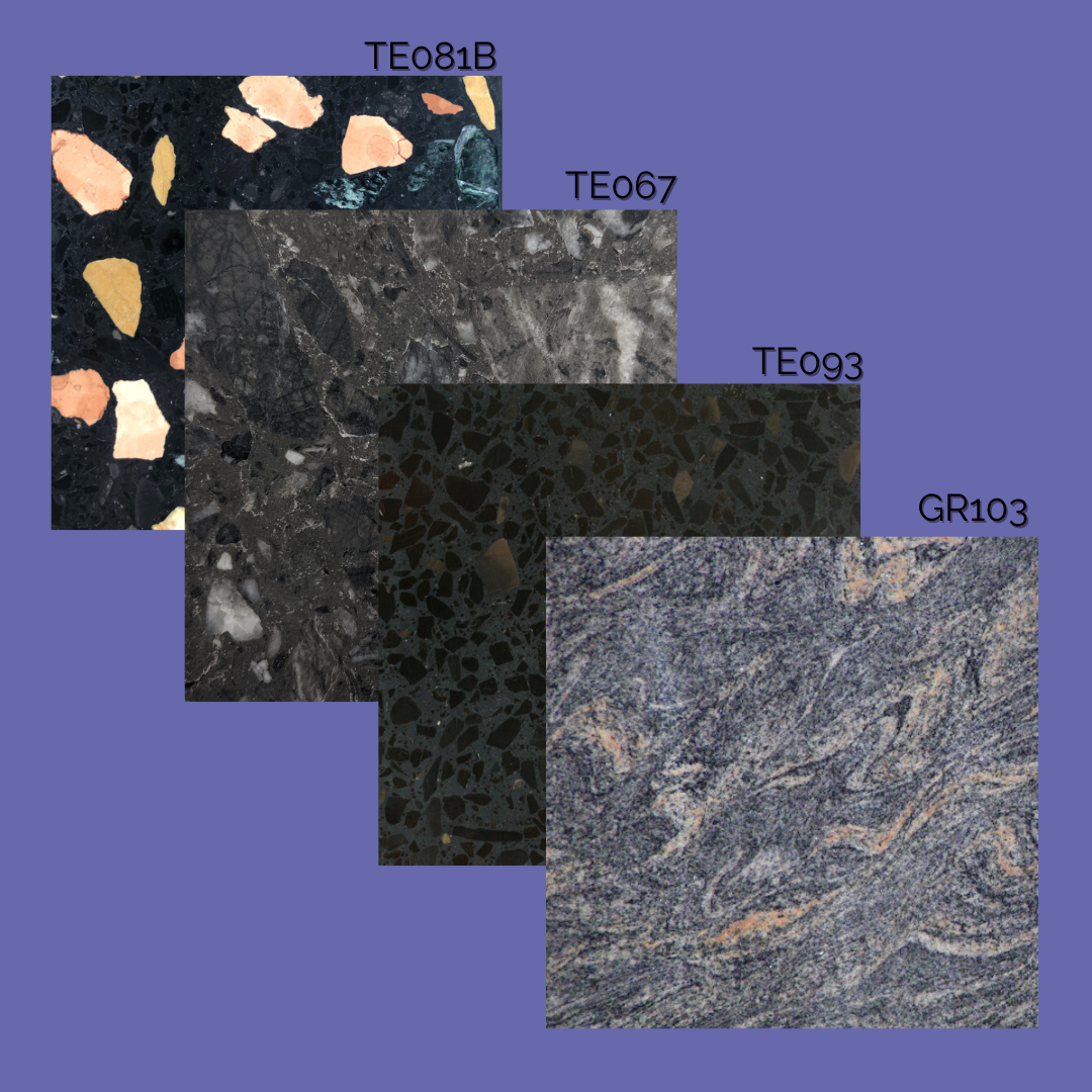
If you prefer a sense of drama in your interior design, then a black terrazzo might float your boat! TE093 would be worth looking at – and don’t rule out TE081B – with its black base and multi-coloured large chippings, this could be a real winner. For something that fits in between these two try TE167!
For those who like the idea of stone surfaces harmonizing with walls, you may be tempted to consider a material that has echoes of blue in it; for this, we would definitely recommend using a swatch to ensure a good match. Options might include a granite such as GR103 which is predominantly grey but with blue tones.
Or if you feel ready to go bold and bright with this blue, Pantone’s helpful ‘Balancing act’ complementary colours palette offers some great brights to pair with Very Peri. Muted but warm greens and oranges balance the warm blue tone. We’ve selected TE040 and TE044 with smaller chippings that would be a great combo for any colour-lover. TE072 brings a pleasant green with larger white chippings and once again the surprisingly versatile TE081B ties all these colours into one product!
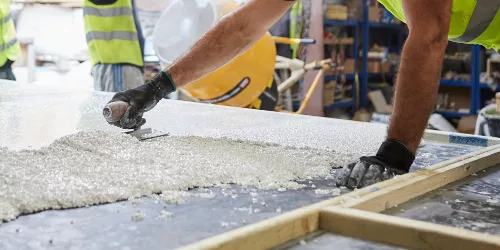
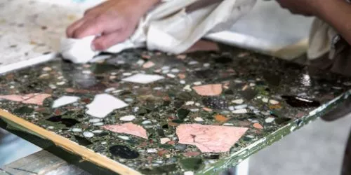
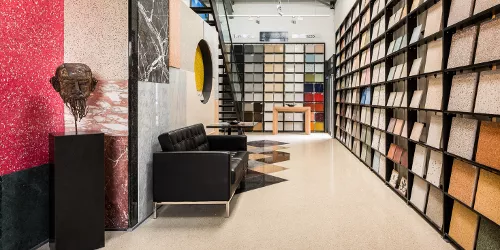
Working with Diespeker, there’s always the opportunity to create a bespoke terrazzo using a base colour to match Very Peri. Or use a white base and we’ll do our best to match the colour as closely as possible using available dyes, chippings or coloured glass. We’ll create bespoke samples so you can be sure that the design works for you.
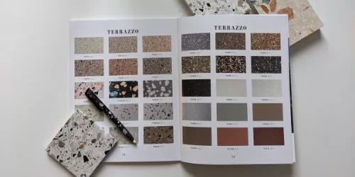
If you are local, a visit to our South London factory and workshops is the best way to get inspiration, whether you are dead keen on using Very Peri or if you have other colours in mind for your interior design for 2022. Alternatively you can call us and we’ll help you as much as we can, including sending out samples from the materials we have in stock, so you can have a play with colour ideas.
Our team loves to discuss ideas with clients, make suggestions and see just what is possible. So get in touch with us this year and chase those new year blues away!